
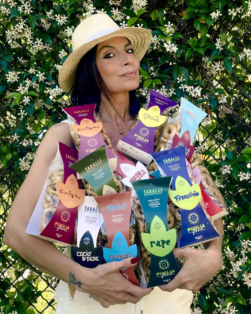
Puglia Food Taralli
The Taste of a Mark: Visual Identity and Lifestyle Design
There are projects in which calligraphy does not arrive at the end, simply adding a signature or decorative element. It enters at the very beginning, when a brand’s visual language and the way it wants to be recognised are being defined.
For Puglia Food, the starting point was precisely this: using handwriting as a tool for identity, bringing the brand not a stereotypical image of Puglia, but its voice.
The result is a visual system that moves across packaging, communication and merchandising, where words, colours, shapes and marks come together to create a contemporary narrative around a product deeply rooted in Apulian food culture.
Writing a Territory
Puglia is often portrayed through a familiar repertoire of images: olive trees, sunshine, the sea and Mediterranean colours.
Here, the approach is different.
Marta Lagna starts with the spoken language, local expressions and the spontaneity of everyday speech. Calligraphy becomes a way of giving form to something intangible: the voice of a place.
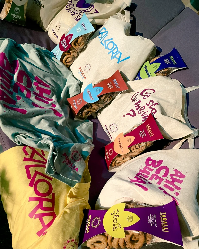
“Allora!”, “Ahi ce bulia!”, “Ce sta cumbina?” are not simply phrases applied to a surface. They are fragments of conversation, expressions belonging to a local cultural landscape which, through the movement of the hand, acquire a new visual dimension.
The writing retains the spontaneity of the spoken word while simultaneously becoming an image.
Calligraphy as Design Material
The mark is not used as a typeface to be mechanically reproduced. It is a living element, constructed through gesture.
Variations in stroke, the rhythm of the letters, proportions and the imperfections inherent to handwriting introduce a physical quality that standardised typography cannot replicate.
This physicality is precisely what makes calligraphy so effective within the project: the word does not simply communicate information. It carries rhythm, attitude and a sense of warmth.
For Puglia Food, handwriting therefore becomes image, pattern, surface and recognition.
An Identity Built Through Layers
The project does not end with calligraphy.
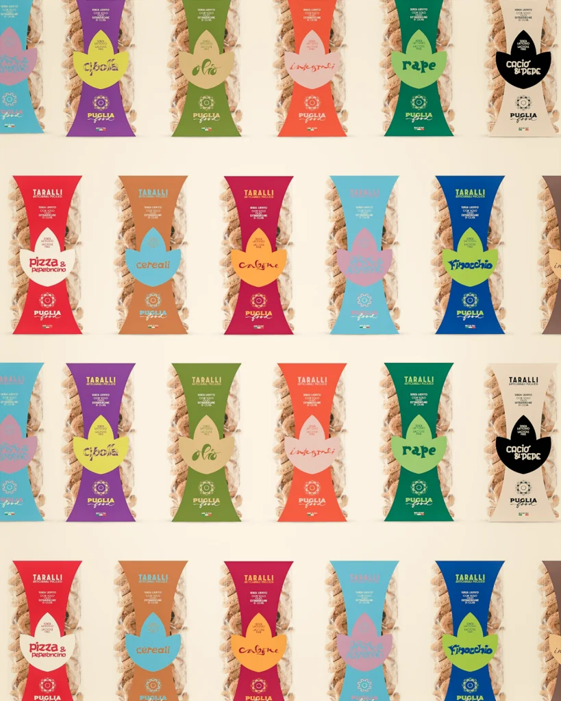
Around the hand-drawn mark, a visual system takes shape through colours, forms and combinations that deliberately avoid conventional solutions. Colour plays a precise role in distinguishing the different varieties, while the diversity of shapes allows the identity to retain both energy and recognisability.
The complexity does not come from adding more elements, but from the way those elements interact.
Words, colours and forms can shift in position and application without losing the shared character that connects them. This allows the identity to move seamlessly from packaging to communication and, ultimately, into objects.
Packaging as a Narrative Surface
Packaging is where this visual language finds one of its most distinctive applications.
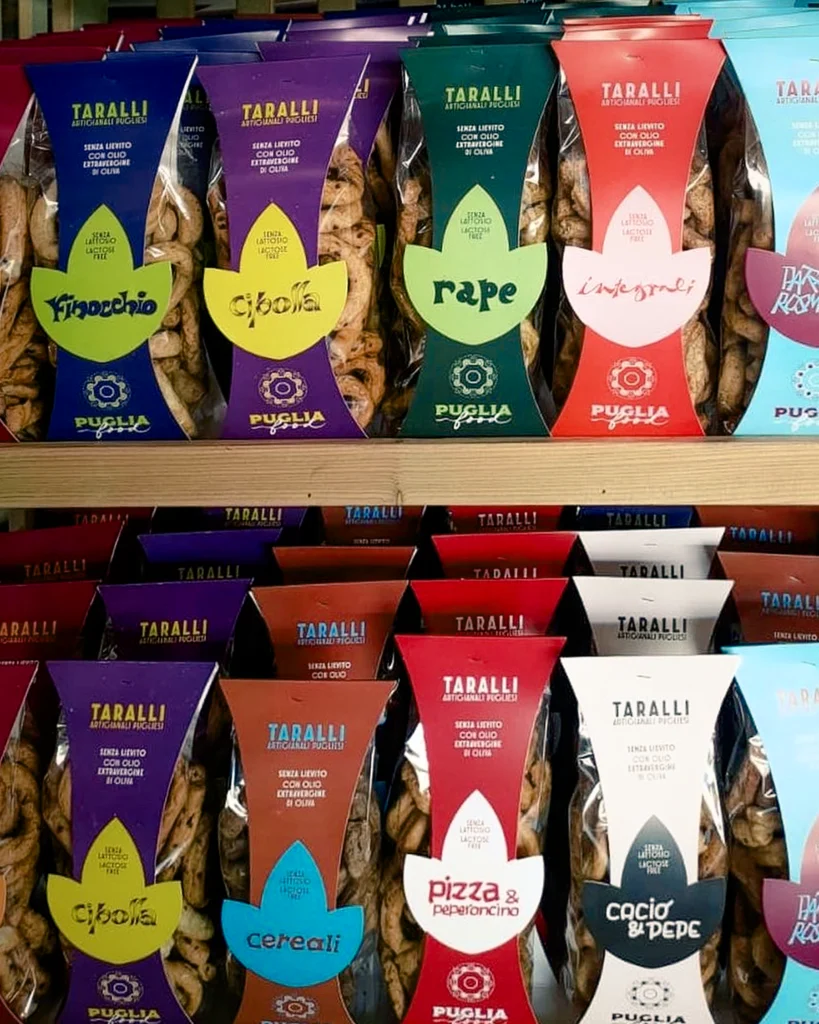
The vertical bag leaves part of the product visible and is wrapped with a coloured cardboard band. The band is not simply an informational support: its central cut-out introduces an organic shape, somewhere between a leaf and a petal, which becomes part of the package’s visual construction.
At its centre, the flavour name is handwritten in a fluid, dynamic script.
The information hierarchy is reconsidered. The name is no longer simply something to read; it becomes a graphic element to recognise.
Packaging takes on a presence closer to a design object than to conventional food packaging.
A Colour for Every Flavour
Colour also plays a fundamental role in building the system.
Different varieties are associated with different shades: purple for onion, deep green for turnip greens, red for the classic flavours and calzone, blue for cereals, and light blue for potato and rosemary.
This is not simply a way of differentiating products on the shelf.
Colour becomes a second form of language which, together with the handwriting, allows the identity to expand while maintaining coherence.
From Packaging to Object
Once the visual language is established, the project moves beyond packaging.
Words from Puglia become the protagonists of the first merchandising collection: tote bags and T-shirts transform expressions originally developed for the brand’s communication into objects to use, wear and take beyond the food context.
This is an important shift.
The tarallo is no longer presented solely as a food product, but as part of a broader cultural and visual universe. Calligraphy allows the brand to occupy a space that sits simultaneously between food, design and lifestyle.
The product becomes a starting point for creating a sense of belonging.
From Product to Language
The strength of the project lies above all in this shift: not decorating a traditional Apulian product, but building a recognisable language around it.
Marta Lagna’s calligraphy becomes the device through which Puglia Food can speak in its own voice, maintaining its connection to the territory without relying on its most predictable visual representations.
Tradition remains in the content, the language and the product. The form, however, looks to the present.
It is within this balance that handwriting finds its role: not as ornament, but as a design element capable of transforming a food identity into a coherent visual system, and an everyday product into an object of contemporary culture.
PROJECT SUMMARY
PROJECT
Puglia Food Taralli
CLIENTE / BRAND
Puglia Food
INTERVENT
Visual Identity · Calligraphy · Packaging · Merchandising
YEAR
2023
DELIVERABLES
Packaging · Lettering · Tote Bags · T-Shirts · Visual Communication