
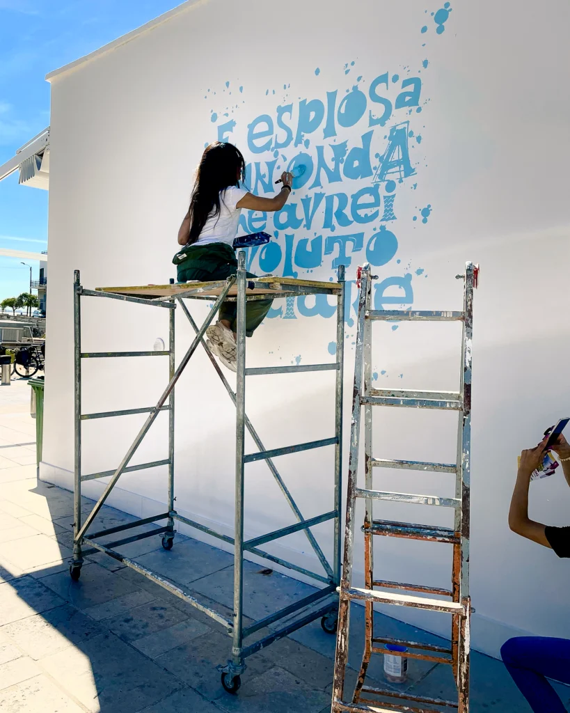
Momento – Santa Caterina
Visual identity and an iconic mural in the square: Valentino’s concept bar
Some places become recognisable before they are even described. Momento – Santa Caterina begins with this idea: creating an identity that belongs to its surroundings while also changing how they are perceived.
For the new concept bar developed in collaboration with Valentino Caffè, Marta Lagna brings her research into urban calligraphy into a broader brand identity project. Walls, graphics, interiors, tableware, packaging and clothing become different expressions of the same visual language.
The result is an identity that extends beyond the venue itself. It occupies the square, enters the landscape and creates an image immediately associated with Santa Caterina.
Santa Caterina, written on the wall
The most visible gesture of the project is also the simplest: writing the name of the place.
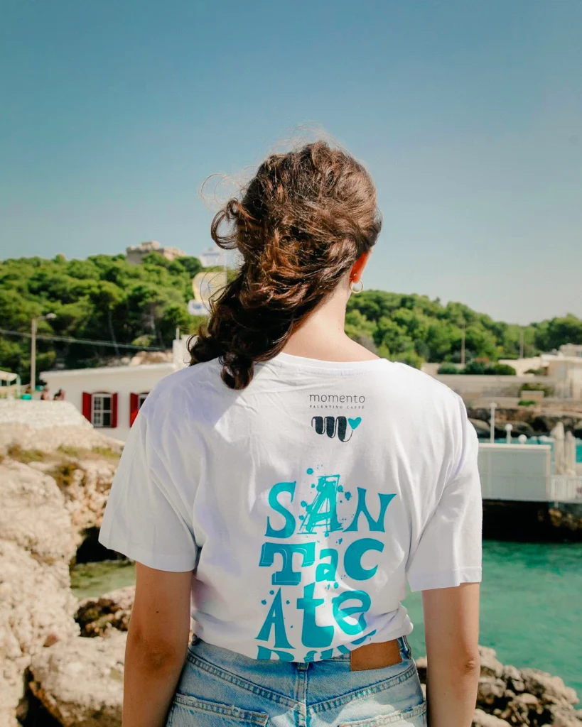
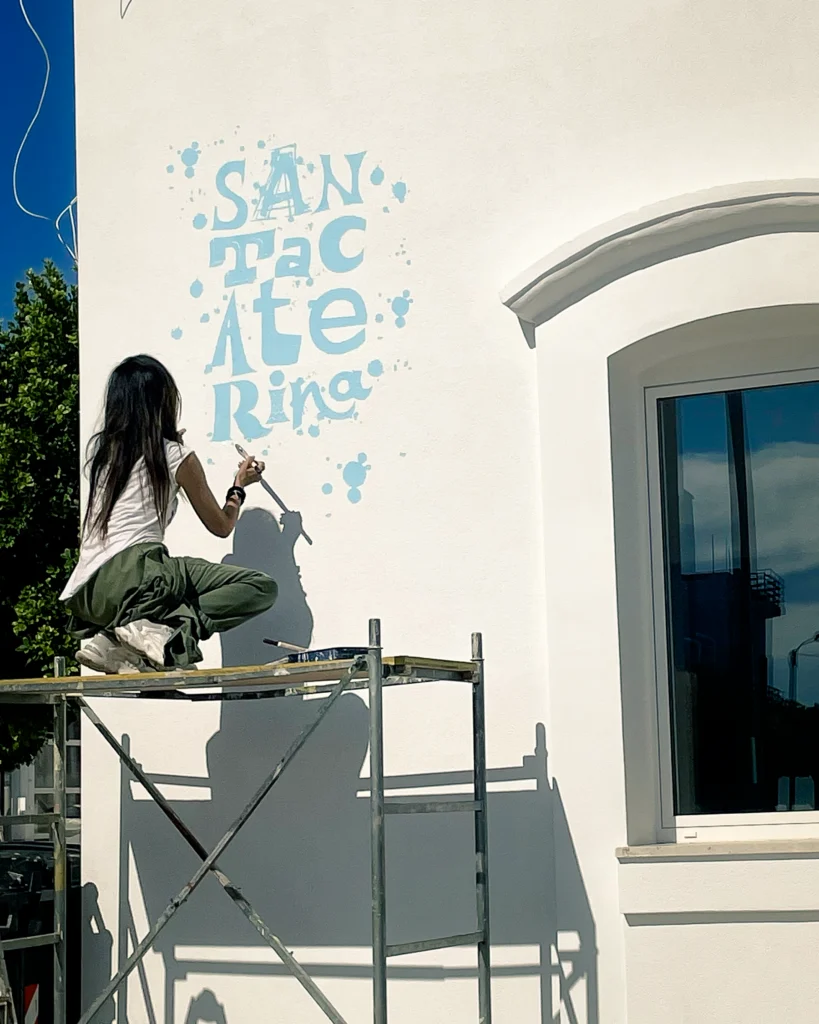
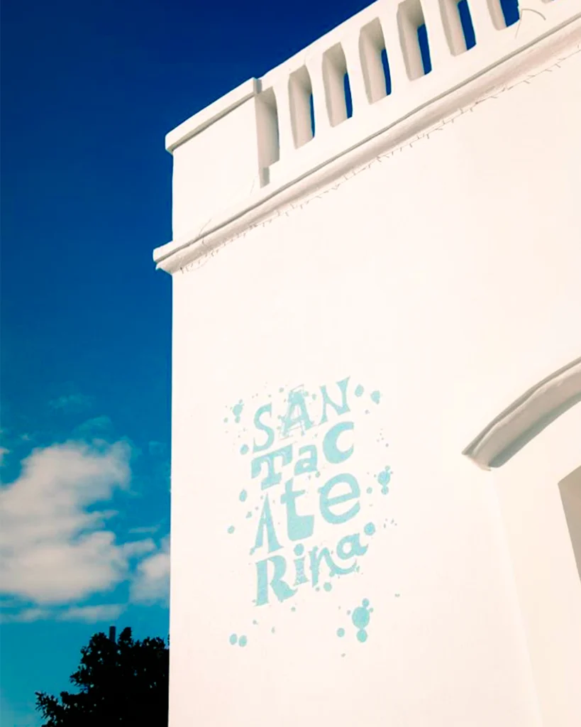
On the large exterior wall, SANTA CATERINA moves away from conventional lettering and is reinterpreted through Marta Lagna’s calligraphic language. Letters expand, break apart and change rhythm; the spontaneity of handwriting meets the scale of architecture.
Turquoise is far more than a brand colour. It becomes a precise interpretation of the surrounding landscape.
It recalls the Ionian Sea, coastal light and the particular range of colours associated with Santa Caterina, transforming them into a visual code.
Splashes and traces of colour introduce an almost physical quality to the lettering, making the wall appear touched by the movement of water.
The name of the town becomes an image.
And that image becomes a point of recognition in the square.
A sentence, another dimension
Inside the venue, the language changes scale while retaining the same visual matrix.
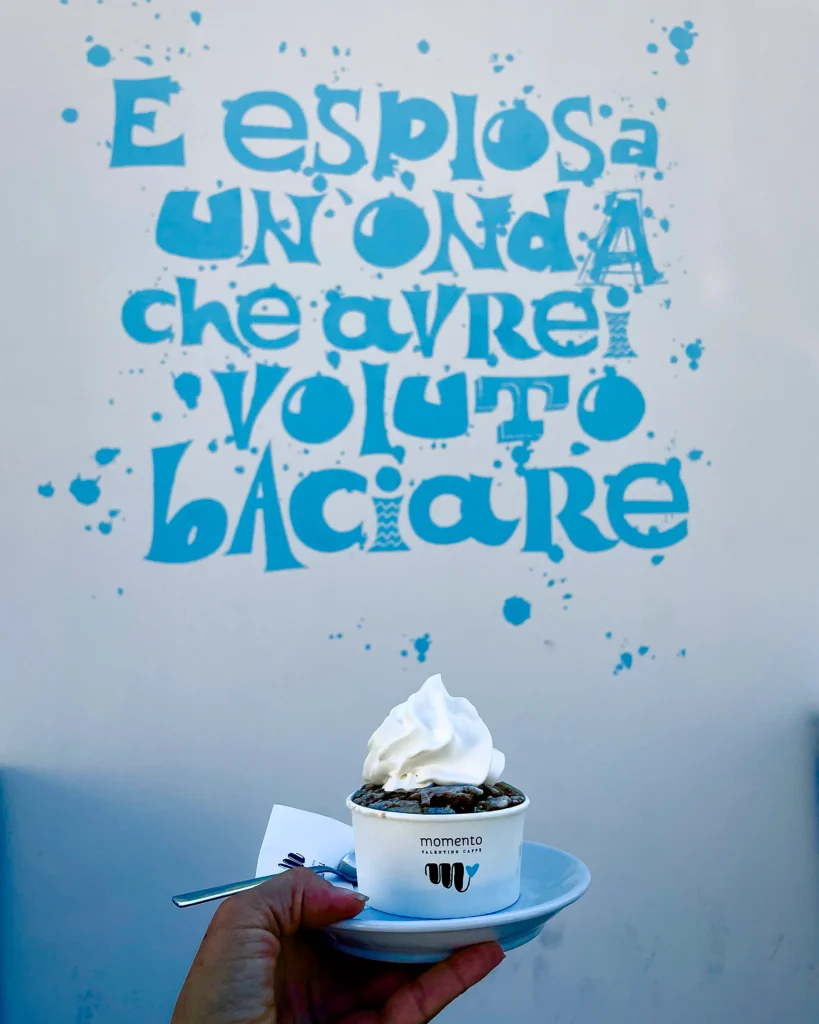
A phrase appears on the wall:
“È esplosa un’onda che avrei voluto baciare.”
Poetry introduces a more intimate dimension. After establishing the identity of the place through large-scale lettering outside, the project moves towards sensation and atmosphere.
The choice is significant: the sea is not represented; it is evoked through words.
Calligraphy becomes a way of creating atmosphere without relying on literal imagery. Gesture, language and colour are enough to establish a relationship between interior and landscape.
When a mural becomes a brand
This is where the project moves beyond the traditional idea of an artistic intervention.
Graphics developed for the wall become a complete identity system, appearing across the elements that shape the everyday experience of Momento.
American-style placemats reproduce the lettering and texture of the mural. The same visual language extends to gelato and Espressella cups, napkin holders, sugar sachets and other table elements, creating continuity between architecture and object.
These are not isolated applications.
They are variations of the same gesture.
The identity can shift from one surface to another while remaining immediately recognisable.
The M and the heart
Alongside the lettering, Marta Lagna introduces another graphic synthesis: the M paired with a heart.
A simple, immediate sign that works almost like a signature.
The M refers to Momento; the heart introduces an emotional dimension connected to the sea, conviviality and the pleasure of food.
Within this identity, “Momento” takes on a precise meaning: a brief stretch of time worth holding on to.
A coffee overlooking the sea. Gelato. Breakfast. Lunch shared with someone.
Ordinary experiences that, through a strong identity, become part of a place’s visual memory.
From the square to the community
The visual system also appears on white staff T-shirts and customer merchandise.
This is an important transition: identity moves from an environmental element to a shared sign. The brand can be worn, photographed, shared and recognised beyond the venue itself.
The mural therefore becomes more than a fixed image on a façade.
It becomes the starting point for a small visual culture.
An image that belongs to Santa Caterina
The strength of the project lies in its ability to operate across different scales.
Urban art meets graphic design, while interiors carry the same visual language into the venue. Colour and lettering reinforce the relationship with the territory, transforming Santa Caterina into a distinctive identity marker.
Marta Lagna builds a brand identity that begins with a real place rather than being imposed upon it.
The sea becomes colour. Words become signs. Signs become identity.
This continuity is what makes Momento recognisable: a project where art and branding cease to function as separate languages and become one visual experience.
PROJECT SUMMARY
PROJECT
Momento – Santa Caterina
CLIENT / BRAND
Momento
INTERVENTION
Brand Identity · Urban Calligraphy · Street Art · Wall Lettering · Interior & Visual Design
YEAR
2022
LOCATION
Via Mario, Via Mastro Gioffreda, 8, 73048 Nardò LE
CONCEPT
A complete brand identity inspired by the Ionian coast, where turquoise tones, expressive calligraphy and a distinctive graphic language connect the iconic mural with interiors, tableware, packaging and merchandising. Marta Lagna transforms the name Santa Caterina into a recognisable visual sign, creating a direct dialogue between place, hospitality and contemporary urban art.