
Canudis
Burning Pride: contemporary design meets calligraphy
In Galatina, inside a nineteenth-century building, Burning Pride takes a precise approach: recognisable elements of Salento architecture are taken beyond their familiar visual language.
Designed by Gloria Colazzo for CanUdis, the apartment does not attempt to recreate a traditional idea of a Puglian home. Star and cross vaults, niches, stone surfaces and the proportions of the historic building have been preserved, but placed within a radically contemporary setting defined by saturated colours, geometric blocks, pop furnishings and graphic interventions.
This is where the calligraphy of Marta Lagna enters the project.
Rather than being added as decoration once the interiors were complete, her work was conceived to occupy and reinterpret some of the apartment’s most significant surfaces: a living room wall, a star vault, a chair and a niche.
The result is an interior in which writing changes scale. A phrase can become a manifesto, a text can turn into a pattern, and a single word can give an object its own identity.
Burning Pride: colour as a spatial structure
Burning Pride occupies 150 square metres on the first floor of the historic building, with two bedrooms, two bathrooms, a kitchen, a living area and a private terrace.
Gloria Colazzo’s design is built first and foremost around colour. In the living room, a strong chromatic division defines the walls: yellow occupies the lower section, while purple rises towards and across the vaulted ceilings. In the kitchen, green meets pink, while orange, blue, yellow and purple return throughout the furnishings and architectural elements.
This choice is crucial to the way calligraphy enters the interiors. Marta Lagna does not work on neutral surfaces, but within an already highly distinctive composition. Her handwriting therefore has to engage with strong geometries, colours and architectural forms without becoming merely a graphic element.
The response lies in scale, rhythm and the physicality of the gesture.
“Cute but Crazy”: the wall as manifesto
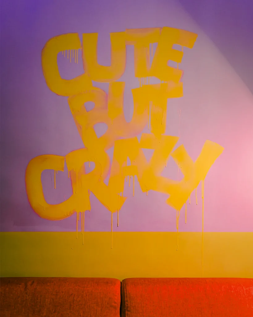
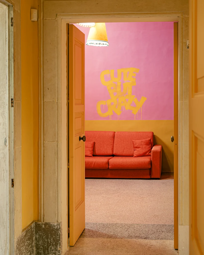
In the living room, above the sofa, a wall becomes the setting for a single phrase: “Cute but Crazy.”
Painted by hand in ochre yellow across a pink surface, the lettering is large and tactile. Its deliberately irregular rhythm, together with visible drips of paint, makes the physical gesture of the work immediately apparent.
The result behaves more like a mural than a decorative inscription.
The phrase also captures the character of the apartment in just a few words: an elegant, carefully designed home that is at the same time ironic, colourful and deliberately unconventional.
Calligraphy therefore introduces a direct form of language into a composition dominated by colour. It does more than communicate a phrase: it constructs an image across the wall.
Letterform, scale and its relationship with the sofa and surrounding colour fields allow the text to be perceived from a distance as a shape in its own right, almost like a drawing.
The star vault becomes a page
The most radical intervention can be found in the first bedroom.
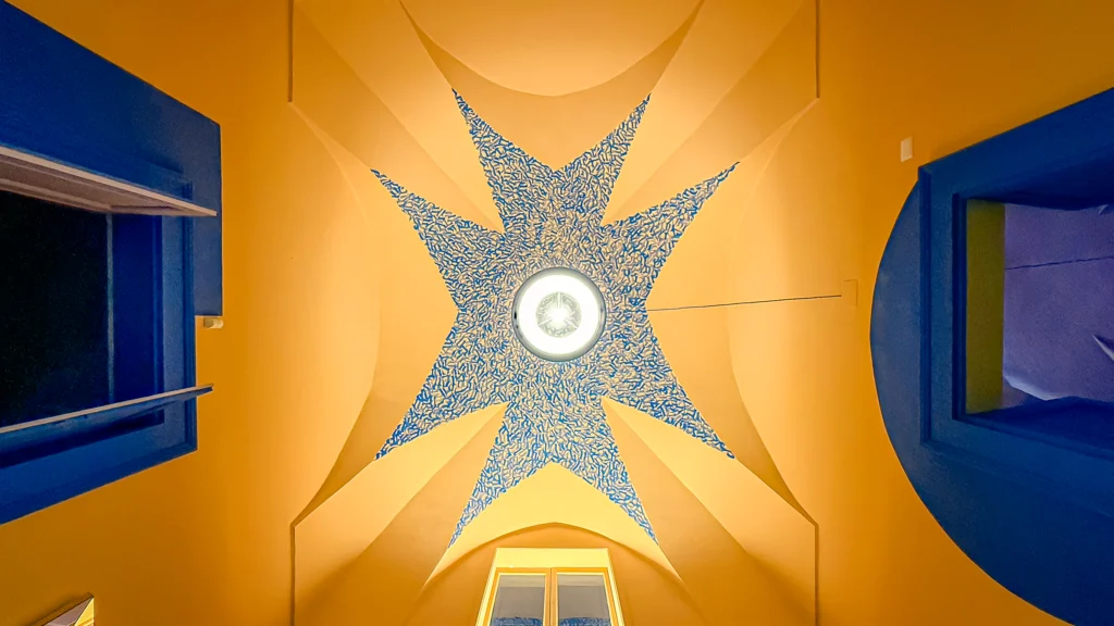
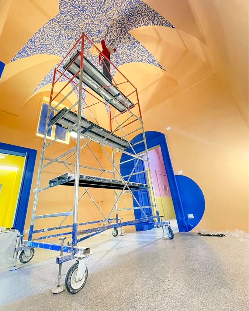
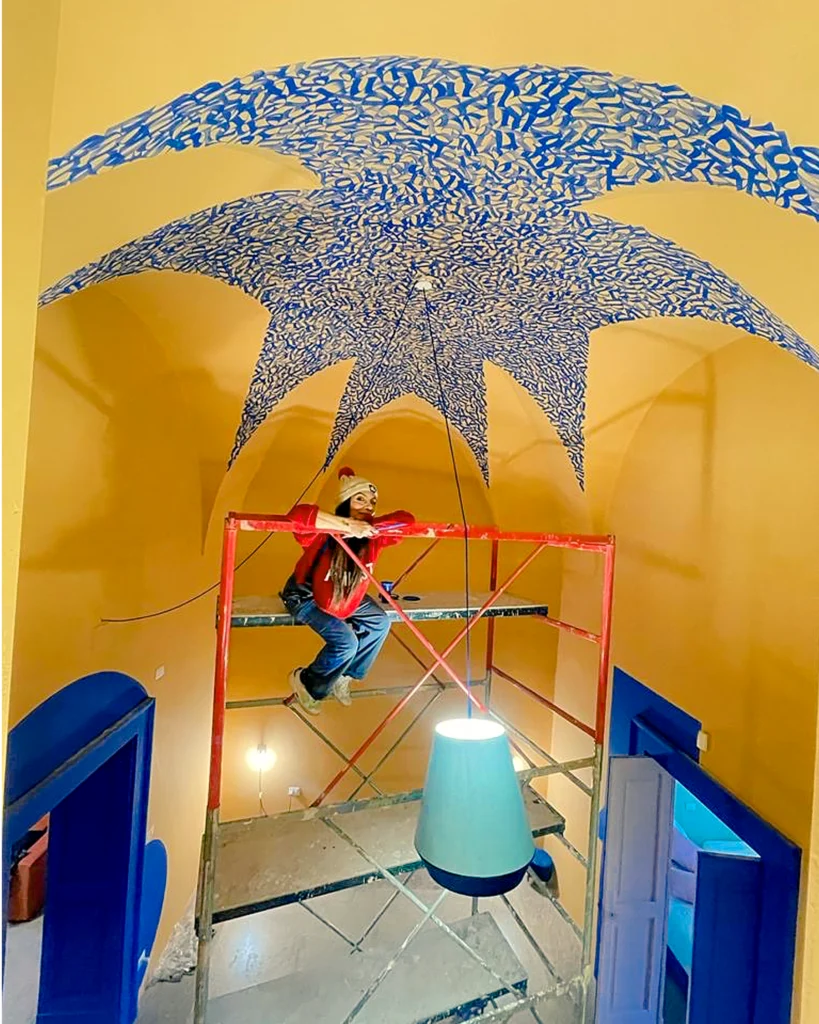
Here, Marta Lagna works directly on the star vault, one of the building’s most distinctive architectural features. Its interior surface is covered with dense cobalt-blue writing.
The chosen text is not accidental. Marta works with an extended passage by José Saramago about travel, taken from Journey to Portugal. The text reflects on the idea of continuing to look, returning to places already crossed and discovering what had previously gone unnoticed.
“The journey never ends. Only travellers end.”
Within the room, however, the text loses the traditional function of a page. It is not arranged on a rectangular surface and does not follow conventional typesetting. The writing follows the architecture of the vault.
Words connect, move closer together and multiply until they form a continuous surface. Up close, the text can be recognised and followed; from a distance, the writing becomes a texture, almost a graphic pattern.
This is perhaps the most significant aspect of the intervention: a literary text becomes visual architecture without ceasing to be writing.
The vault is not covered in order to conceal its structure. On the contrary, calligraphy follows its geometry and makes it even more visible. Marks fill the inner surfaces while preserving the architectural pattern, creating a sharp contrast with the historic structure.
Traditionally, a Salento vault might become a support for floral decoration, ornamental motifs or references to nature. Here, the visual language changes completely: decoration gives way to words.
A bedroom thus becomes a place for a journey that can be read across the ceiling.
Writing moves beyond the walls
The project does not stop at architectural scale.
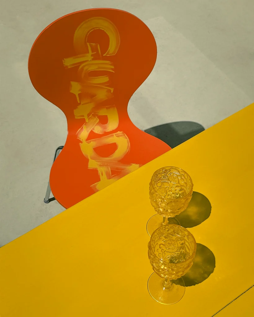
On an orange chair, Marta Lagna hand-paints the word “Guarda” vertically in yellow, creating a contrasting graphic gesture.
Compared with the large-scale vault, the intervention is minimal, but it belongs to the same research: transforming a functional element into a support for writing.
Rather than sitting frontally like a label, the word follows the shape of the backrest and emphasises its verticality. The object acquires a new identity without losing its function.
Placed alongside the yellow table and the other chromatic elements in the room, the chair becomes a small one-off piece within the overall composition.
Calligraphy therefore moves from architecture into furniture, maintaining the same visual language while changing scale.
Vertical writing inside the niches
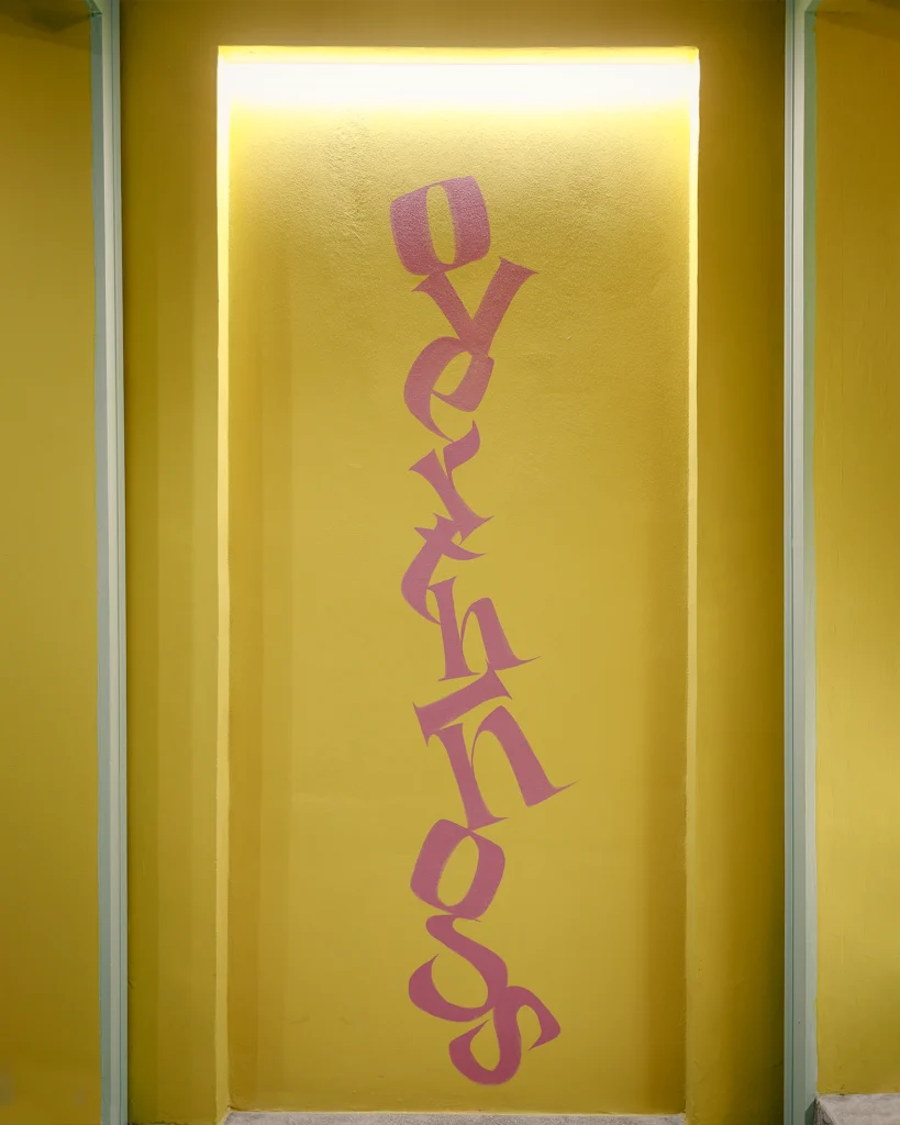
Another intervention develops inside one of the apartment’s vertical niches.
Here, the writing adapts to the particular configuration of the space. Letters follow a vertical, fragmented rhythm, creating a composition that works with the depth of the niche and the relationship between its back and side walls.
Once again, the text is not treated simply as a sentence to be read. The arrangement of the letters becomes part of the architectural form.
A niche, a characteristic feature of historic homes, is reinterpreted through a contemporary gesture. The word enters an architectural void and turns it into a point of visual attention.
Calligraphy designed for colour
Marta Lagna’s work at CanUdis is built around the relationship between three elements: writing, colour and architecture.
Cobalt blue on the vault interacts with the bedroom’s palette; the yellow “Cute but Crazy” lettering emerges from the pink wall; the word “Guarda” transforms the orange chair into a graphic element.
There is no single calligraphic treatment repeated throughout the apartment. Each intervention responds to the surface on which it is created.
This ability to adapt to space is what gives Marta Lagna’s work its coherence. Writing changes function according to the architecture it encounters: across a large wall, it acquires an almost painterly presence; on the vault, it follows the geometry and becomes a continuous surface. On furniture and inside niches, the intervention becomes more precise, contributing directly to the identity of both object and space.
This variation in scale is what holds the project together: calligraphy has no predetermined form, but takes on the form required by the space.
A historic building without nostalgia
Burning Pride treats historic architecture not as a backdrop to be preserved unchanged, but as material for reinterpretation.
Vaults remain recognisable, as do the niches and structural elements of the building. What changes is the way they are seen.
Colour sharpens the architectural geometry. Contemporary furnishings introduce new contrasts. Calligraphy brings a narrative dimension to the surfaces, adding something that architecture alone could not provide.
The project is particularly significant within Marta Lagna’s practice because it takes her research beyond the traditional support of canvas and tests it against a real, complex and already highly characterised environment.
At CanUdis, calligraphy is not hung onto the project: it is painted into the project.
Vault becomes page.
Wall becomes manifesto.
Chair becomes a one-off piece.
And a contemporary interior created inside a nineteenth-century building in Galatina finds in writing a new way to express its identity.
PROJECT SUMMARY
PROJECT
Canudis — Burning Pride
CLIENT / BRAND
CanUdis
INTERVENTION
Wall calligraphy · Star vault · Calligraphic pattern · Calligraphy on object
YEAR
2025
LOCATION
Via Stella 16, Galatina (LECCE)
CONCEPT
Calligraphy becomes material, transforming historic architecture into a contemporary space.